
By Fasika Kelile. Date: June 19, 2025
Version 1 link: https://fifidesign.uk/design-for-web-content/small-business-website/index.html
Version 2 link: https://fifidesign.uk/sbw-php-view/index.php
VERSION 1
Reflecting on the Original Recursive Records Website
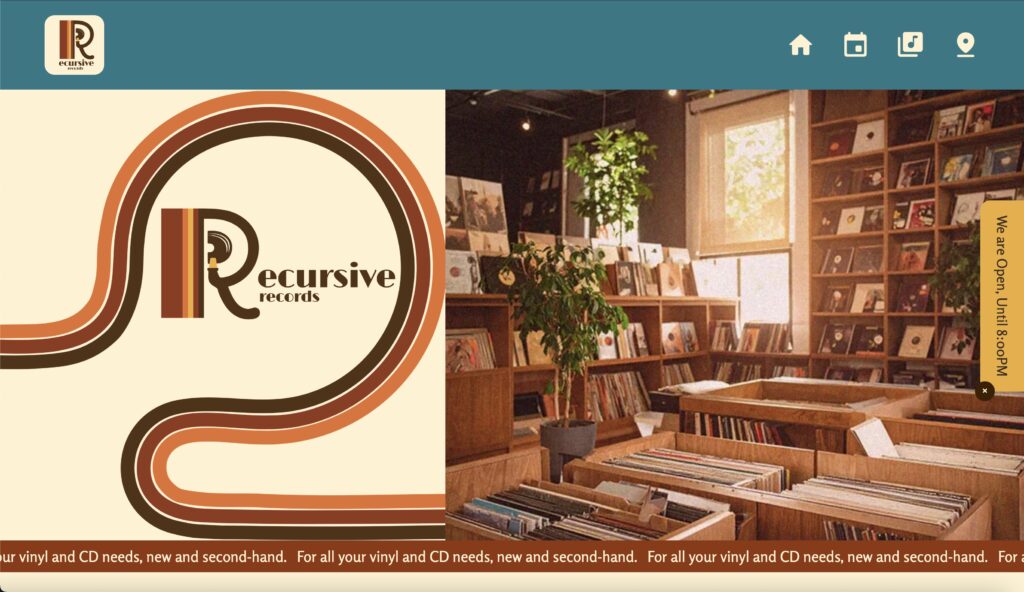
When I built the Recursive Records website for my Design for Web Content module, I wanted it to do more than just sell records online. I aimed to capture the atmosphere of a physical record store that is warm, nostalgic, and rooted in vinyl’s analog history. I wanted the site to evoke the experience of owning and collecting records, not just listening to them.
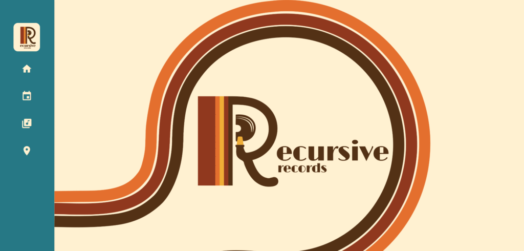
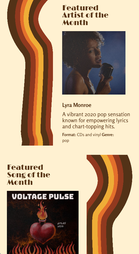
The Vision: Nostalgia, Warmth, and Analog Energy
From the beginning, I focused on creating a strong sense of brand identity. I leaned into the aesthetics of the 1970s and early 1980s which are the golden age of vinyl. I made design choices based around this core idea of bringing nostalgia within the modern website. To bring that feeling to the website, I focused on:
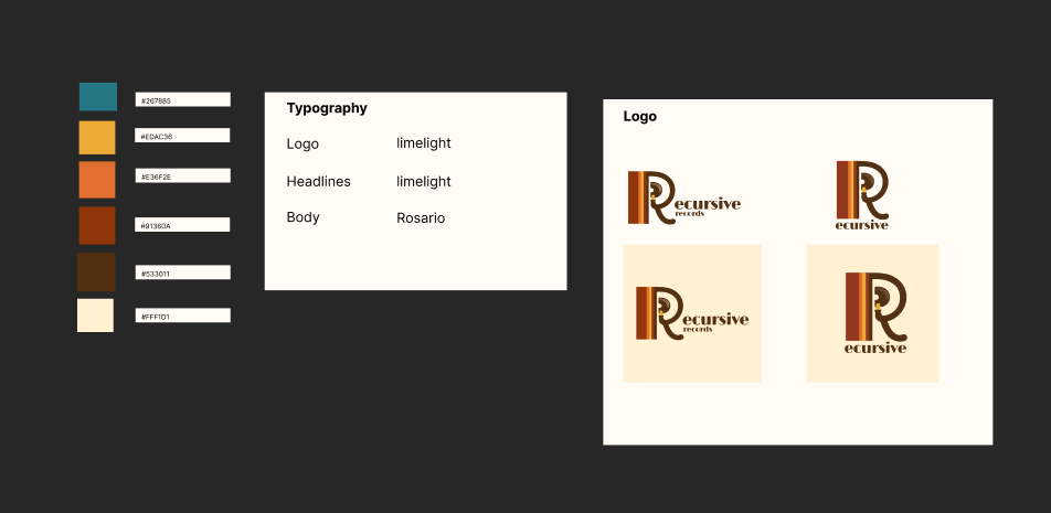
- Typography: I chose fonts inspired by vintage album covers.
- Color Palette: Warm, muted hues like mustard yellow, dusty blue, and rich brown.
- Visual Assets: I designed a custom logo, album artwork, and even hand-drawn elements to make the site feel like a time capsule.
I was especially happy with the logo. It had the right energy, and my professor called it out as a strong part of the visual identity.
Brand
Where It Fell Short: A Deep Dive into My Design Process
When I started building the first version of Recursive Records, I knew I wanted to lean into a bold concept and keep things clean and accessible. I took a mobile-first approach, used semantic HTML and modern CSS, and really worked to bring the vibe of a vinyl store to life. Despite this, as I stepped back and viewed the site holistically, I began to see the shortcomings. As this was my first time building an entire experience around a fictional Brand I leaned more into exploration of design and techniques. Due to this exploration the overall balance of the site was lost.
1. Structure and Communication on Desktop: The Rhythm Got Lost
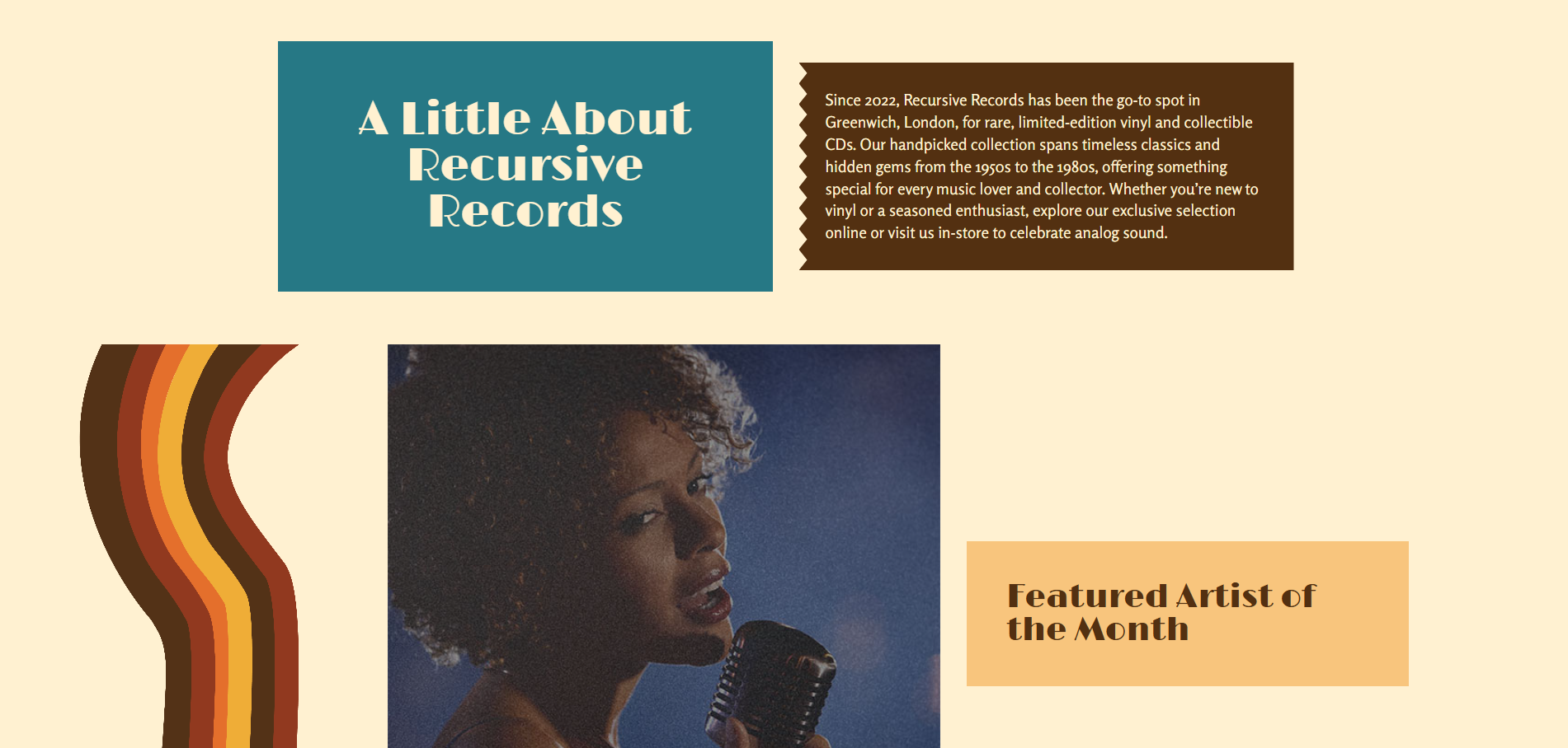
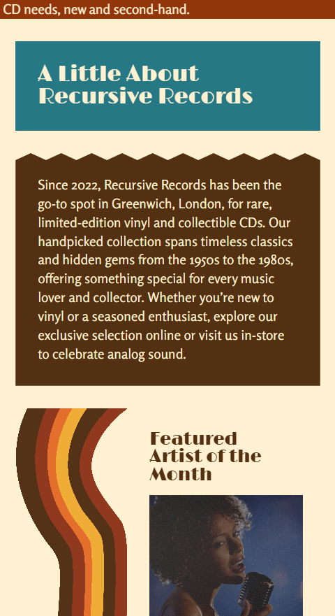
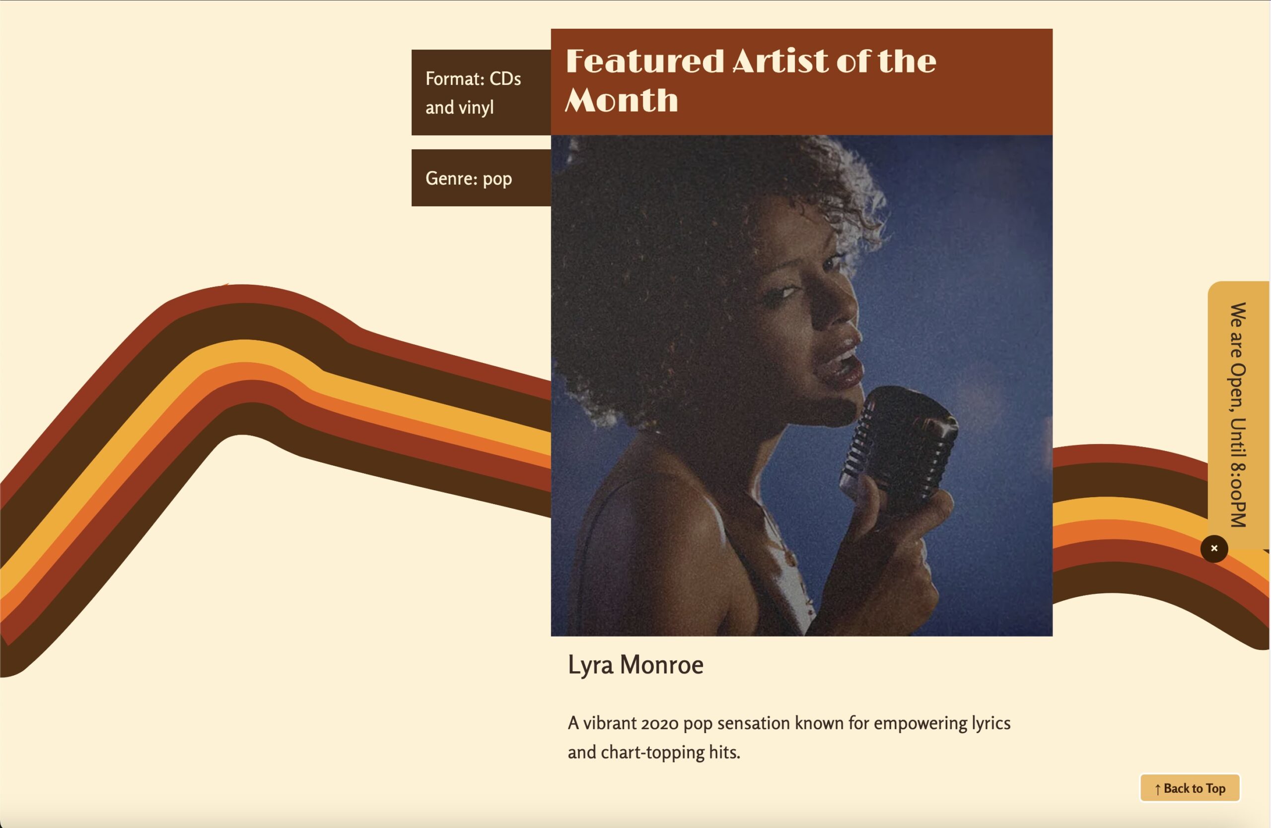
One of the most noticeable weaknesses emerged on larger screens. While the mobile version had strong visual rhythm and flow, the desktop layout felt scattered. Content blocks lacked cohesion. The main image shrunk awkwardly, and elements began to float, but in a disconnected one.
In my feedback, this was noted clearly:
“It’s not immediately obvious that this is a site promoting a physical store… the overall design lacks coherence with many blocks of content floating in the page.”
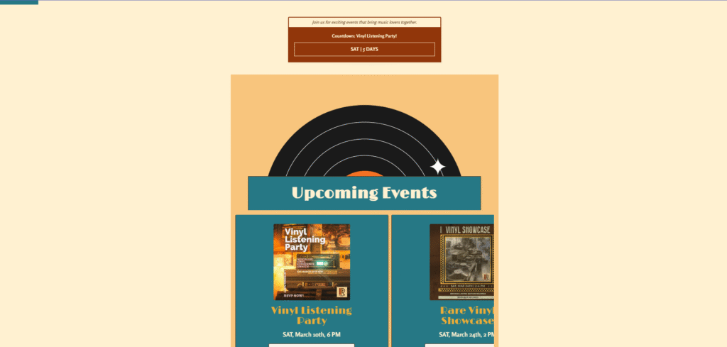
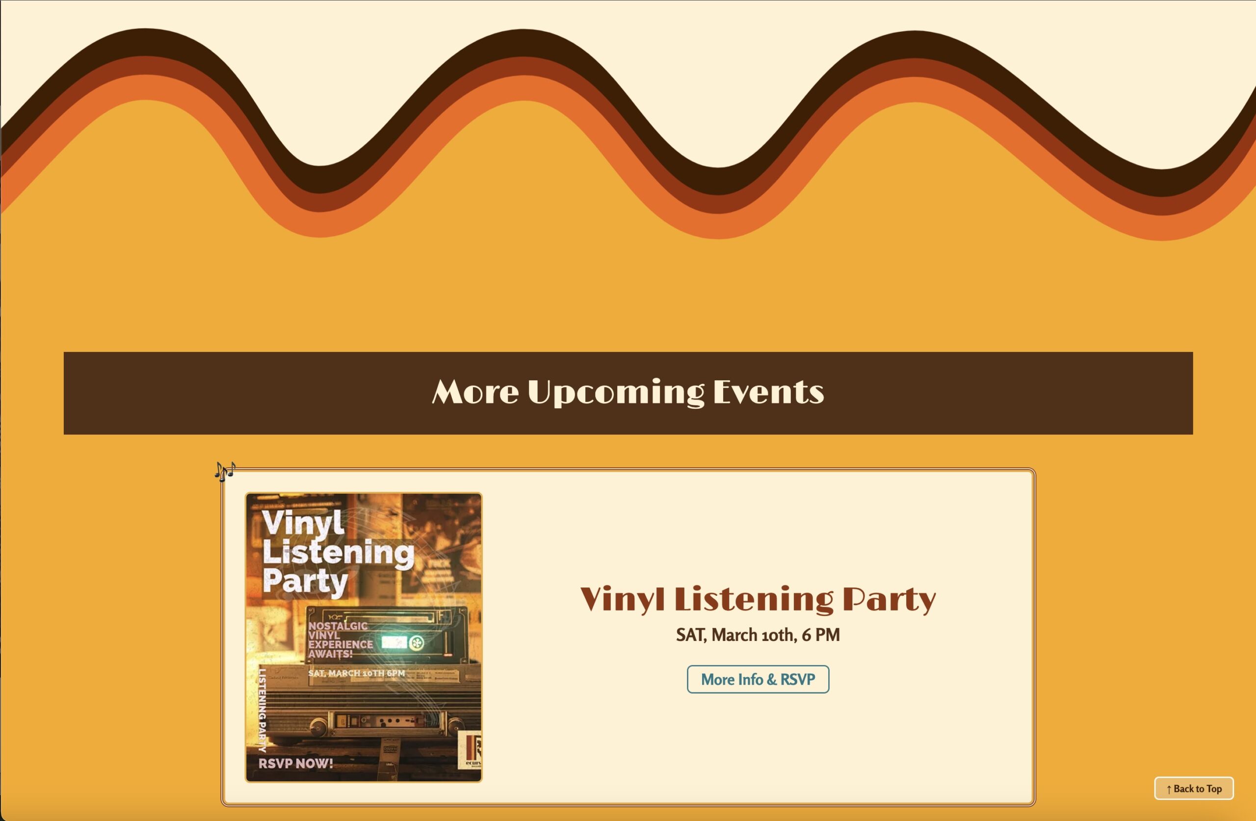
2. The Events Page Missed the Mark
The Events page was another area where I tried to push boundaries. I went with a horizontal scroll layout to mimic flipping through posters or flyers, something you might experience in-store. But in reality, it didn’t function the way I had hoped.
It felt disconnected from the rest of the site and was difficult to navigate. My professor appreciated the experimentation but wasn’t convinced it was effective:
“I’m not convinced the horizontal scroll on the Events page is effective… but I’m glad to see you experimenting.”
This was a valuable lesson for me. Design experimentation is important, but it also has to serve usability and consistency.
3. No JavaScript = Limited Interactivity
At the time of creating the first version, I hadn’t started learning JavaScript, so everything was built with HTML and CSS. I used CSS for simple animations, like hover states and a scrolling banner but there was no real interactivity or user control.
- No pause/play control for animations
- No dynamic elements
- No real interaction beyond clicking links
It worked, but it wasn’t very accessible or user-friendly
4. Clean Code, But Not Modular
Structurally, the code was strong. I used semantic HTML, modern CSS layout tools like Grid and Flexbox, and made sure to validate everything. I also worked with advanced selectors to keep the CSS lean and avoid overusing classes and IDs.
However, one major limitation was that the site was completely static:
- This made future edits time consuming and error prone especially if the site ever needed to scale up.
- I didn’t use PHP includes.
- The header, navigation, and footer were all repeated manually across every page.
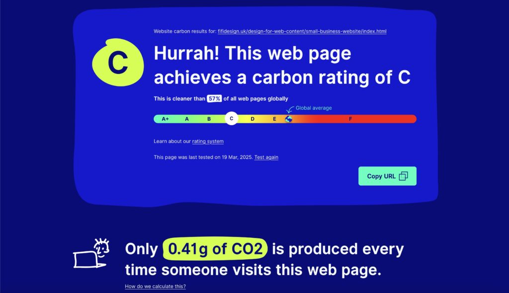
5. Performance and Sustainability Gaps
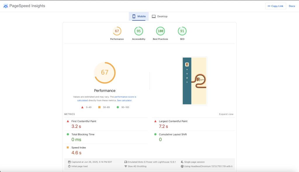
Image handling was another area that could be improved in the first version. While I optimised my JPEGs for web, I wasn’t using lazy loading, and I wasn’t aware of newer formats like (.webp). As a result, pages with more images, like the Catalog and Events sections, loaded more slowly.
This showed up in my performance scores:
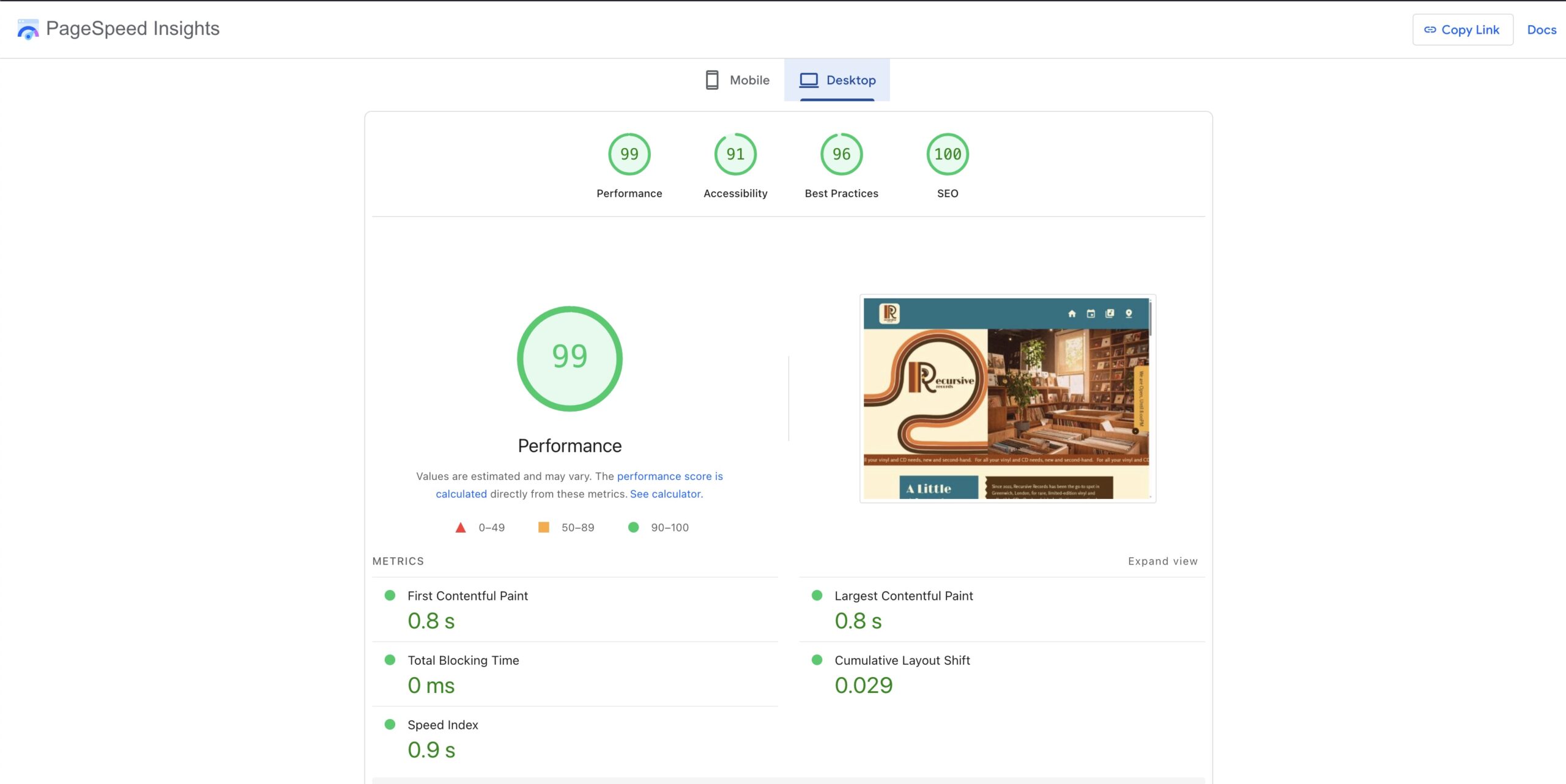
- Google Lighthouse (Mobile) gave the site a 67 in performance.
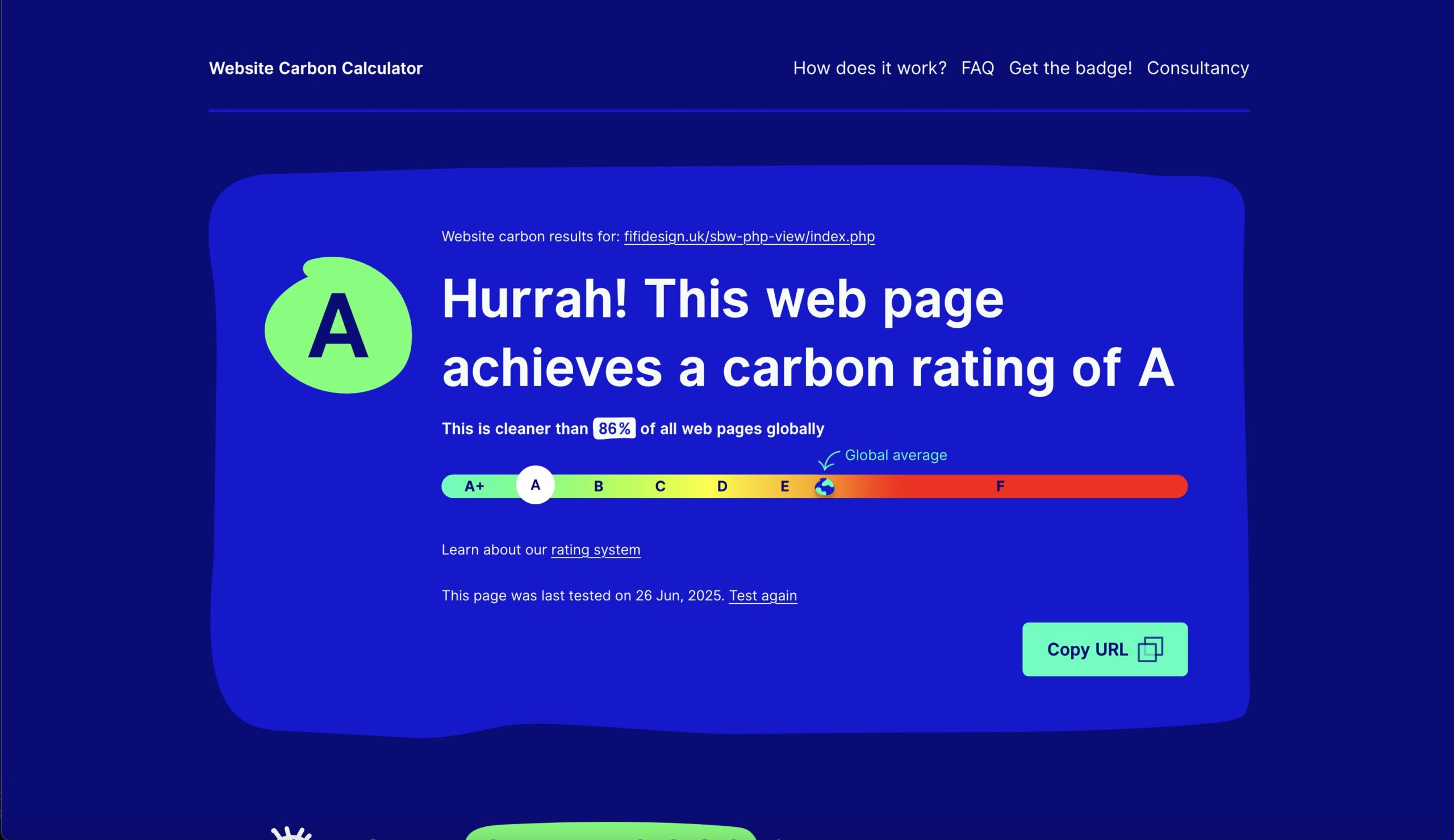
Website Carbon Calculator rated it a C, cleaner than 57% of tested websites.
What’s Next
This first version of Recursive Records helped me understand what kind of designer I want to be: thoughtful, creative, experimental, and user-centered. It also gave me the groundwork to build something stronger.
In the next part, I’ll walk you through into how I rebuilt Recursive Records: better structure, better messaging, smarter code, and a stronger focus on sustainability.
If a value can be determined in advance, use a static value instead. Overusing calc() where it’s not needed can make the code more complex and harder to maintain.
VERSION 2
Rebuilding Recursive Records: A Deep Dive into What Changed (and Why)
When I decided to rebuild the Recursive Records website, I approached it as an opportunity to apply everything I’d learned since creating Version 1. I started by breaking the old site into layers: what was worth keeping, what could be improved, and what had to be completely rethought.
I also studied my professor’s feedback closely to make sure that the new version fixed the issues that had been identified.
- Fixing the lack of cohesion, poor communication of the store’s physical presence, and weak desktop layout.
Here’s a detailed look at what I changed and how each improvement contributed to a more successful site, creatively, technically, and experientially.
1. Interactivity & Usability: Making It Dynamic
What was wrong:
- Homepage in Version 1 looked fine on mobile but lacked impact on desktop; floating, unstructured content.
- Failed to clearly show Recursive Records as a physical store.
- Events page used a horizontal scroll that confused users and felt disconnected from the rest of the site.
How I fixed it:
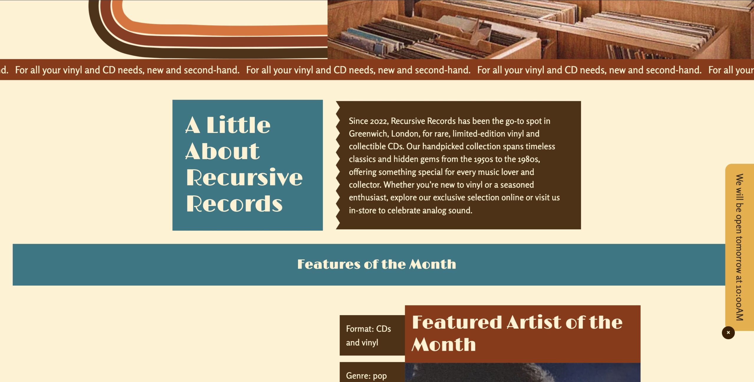
I started with sketching low-fidelity wireframes to reimagine the structure, and focusing on telling the store’s story at every screen size. Content was grouped into clear sections with a stronger visual hierarchy, and imagery was made more prominent, particularly on desktop.
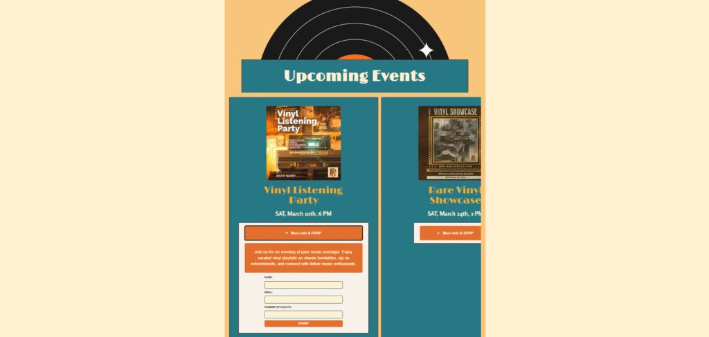
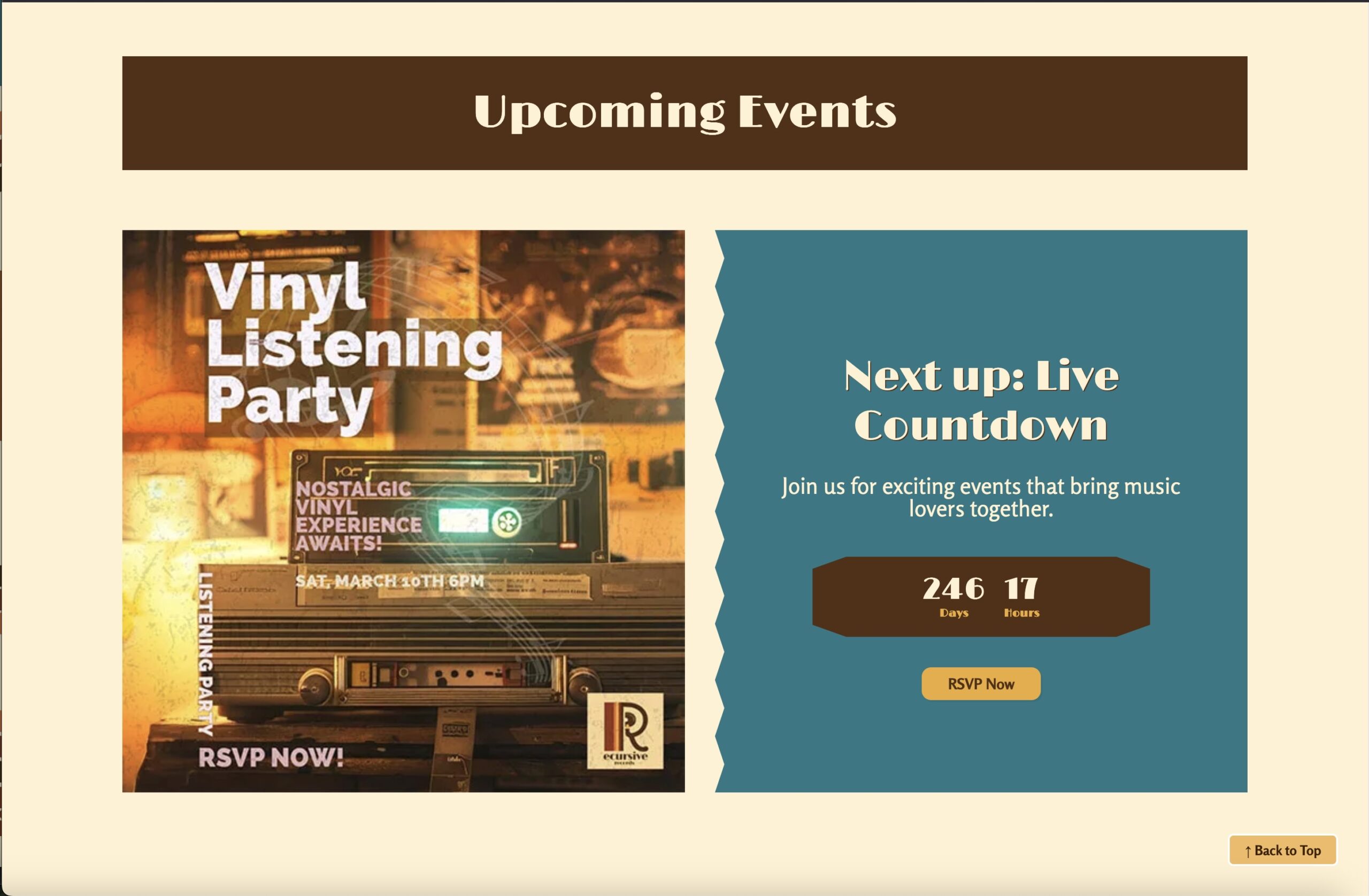
On the Events page, I switched to a vertical layout that’s consistent with the brand and easier to navigate. To make it more engaging, I added a live countdown timer showing time left to the next event.
Home Page
Events page
2. Design & Layout: Telling the Store’s Story
What was wrong:
- The site was static and had no dynamic elements or interactivity.
- The homepage banner animation ran endlessly, couldn’t be paused, and ignored reduced-motion settings.
How I fixed it:
I added JavaScript features that make the site feel alive while respecting accessibility:
- A back-to-top button improves navigation, and the Events page countdown adds energy and urgency.
- An “Open Now” indicator that shows store hours dynamically.
- The banner now runs smoothly, pauses on hover or click, and respects user motion preferences.
These small interactions make the site more engaging and user-centered without overwhelming visitors.
Events page
3. Code Structure & Maintainability: Smarter, Cleaner
What was wrong:
- Header, footer, and navigation were repeated manually on every page it would be hard to update.
- CSS lacked clear organization, making it harder to scale.
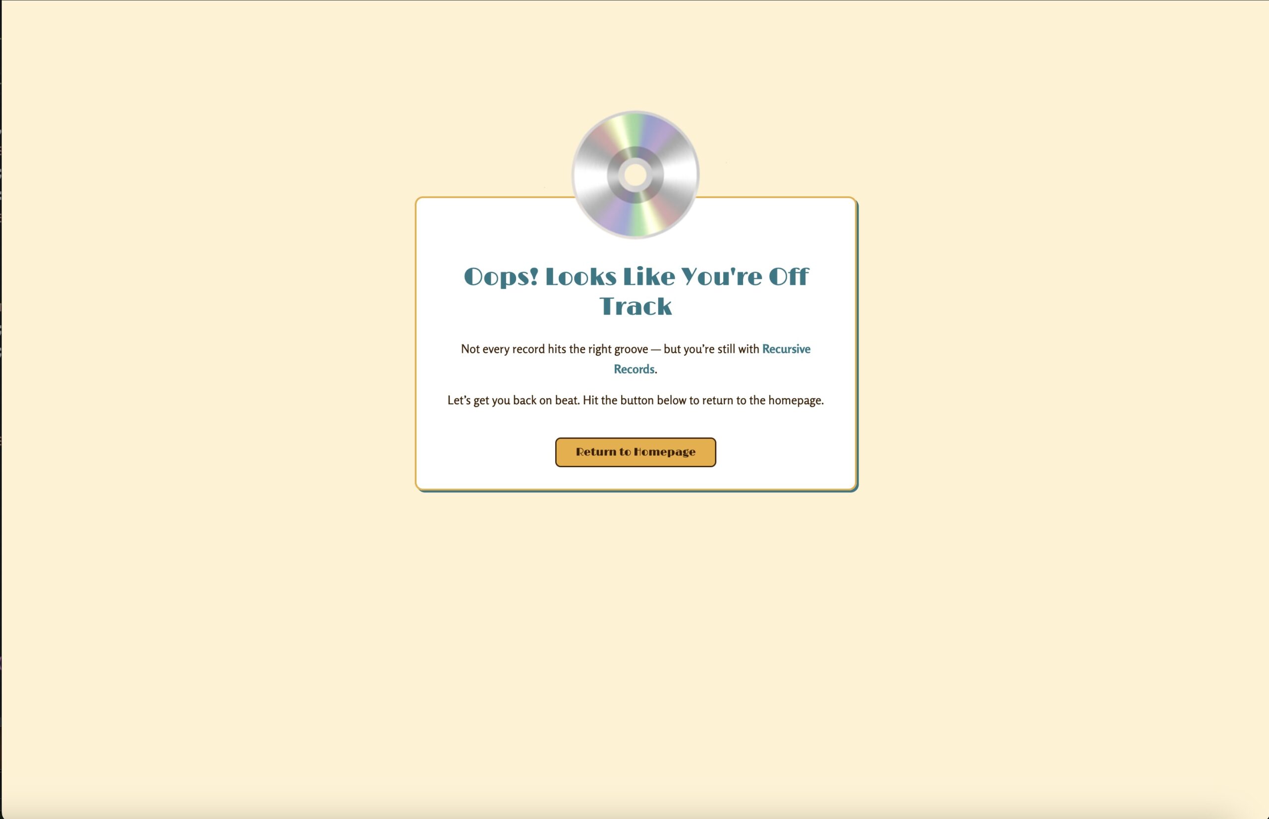
- Broken links led to a generic browser error page, it was unhelpful
How I fixed it:
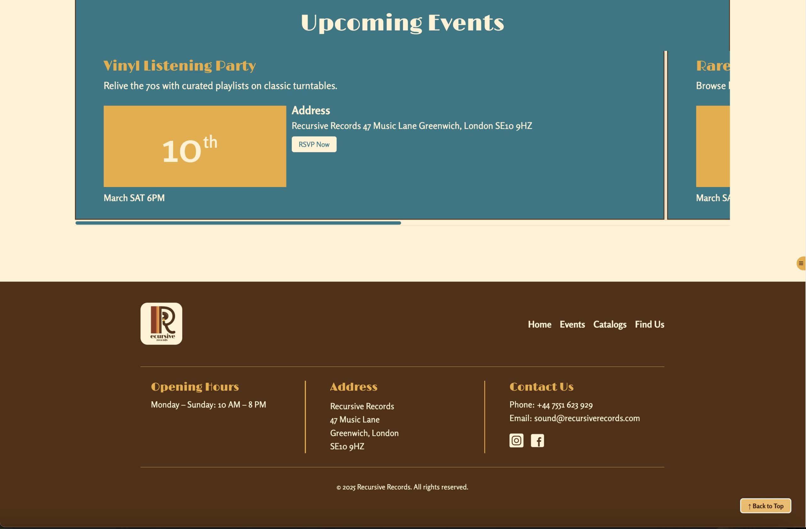
I modularized the structure using PHP include statements for the header, and footer, making updates easy and consistent across the site.
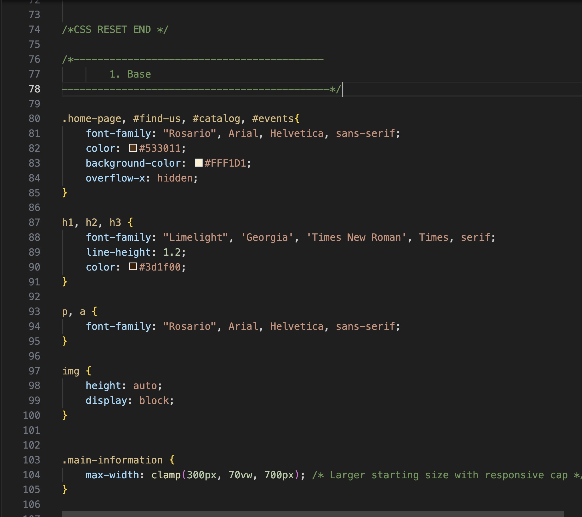
For CSS, I adopted a SMACSS + BEM methodology to write organized, modular, and scalable stylesheets. The codebase is now cleaner, easier to maintain, and future-proof.
I designed a custom 404 page that reflects the brand’s tone and design, with helpful navigation links to bring users back into the site.
Events page
4. Performance & Accessibility: Faster and More Inclusive
What was wrong:
- Images were heavy JPEGs, all loaded at once.
- No lazy loading, slow performance, and a higher carbon footprint.
- Accessibility gaps: weak ARIA roles and no motion control.
How I fixed it:
- I optimized all images to .webp format and added lazy loading, which reduced load times and lowered the carbon footprint.
- I improved accessibility by adding meaningful ARIA roles, alt text, keyboard-friendly navigation and motion is now controllable. These optimizations improved site speed and sustainability significantly, as reflected in better Lighthouse scores and a higher Website Carbon rating.
Events page
Final Thoughts
Rebuilding Recursive Records taught me that good design isn’t just about how a site looks, it’s also about how it feels, how it works, and how it respects the user.
With Version 2, I was able to preserve the retro, analog spirit of the original concept while addressing its weaknesses with smarter code, better usability, and more thoughtful design.
This project reminded me that every decision, from how a banner moves to how images load, will shape the experience for real people. I’m proud of how Version 2 brings together creativity, functionality, and accessibility in a way that feels true to the brand and meaningful for the user.
Leave a Reply