
By Fasika Kelile. Date: February 19, 2025

Presentation Slide link: file:///Users/fasikakelile/Downloads/Seminar-3.pdf
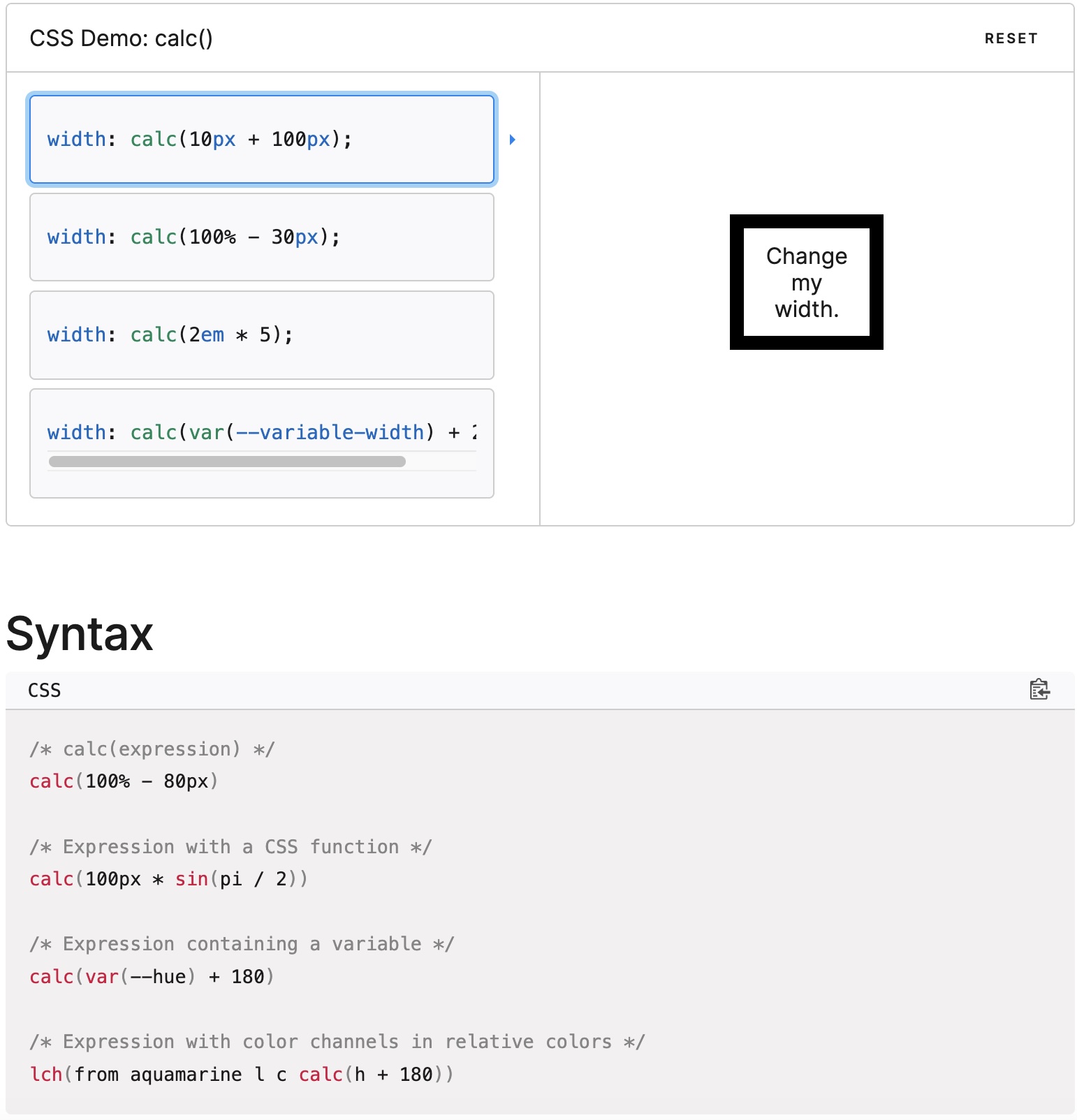
What is the calc() CSS Function?
The calc() function in CSS is a mathematical tool that allows developers to perform real-time arithmetic calculations for property values. This function enables dynamic styling by combining different length units and performing operations such as addition (+), subtraction (-), multiplication (*), and division (/).
Basic Syntax
selector {
property: calc(expression);
}
Example
Main {
width: calc(100vw – 10%);
}
What expression mean
The expression parameter represents a calculation that results in a single value for the CSS property.
How to Use calc() in CSS?
The calc() function can be utilized for CSS properties that accept length values, including:
Few proprties in css that take length:
- width, height, padding, margin, border, box-sizing, font-size
CSS supports various length units that can be combined using calc():
- Absolute Units: px, in, mm, cm, pt, pc
- Relative Units: %, em, rem, vh, vw, vmin, vmax, ex, ch
How to apply calc()
Calc() can allow you to dynamically compute values for CSS properties. Here is how to apply it.
- Mixing different CSS units:
- Creating Responsive Layouts:
- Defining Dynamic Margins and Padding:
- Combing with other CSS Functions:
Why Should You Use calc()?
Allows Mixing Different Units: Since CSS uses a variety of units (px, %, rem, vh, vw, etc.), calc() makes it possible to combine them effectively.
Enables Dynamic Layout Adjustments: The browser calculates values in real-time, adjusting element properties dynamically based on viewport size and other factors.
Simplifies Complex CSS Logic: Instead of manually calculating values for multiple breakpoints, calc()automates these calculations, making code more readable and maintainable.
Demo 1
Example Implementations:
Adjusting Width/Margin Dynamically
Goal: Create a responsive layout where width/margins adjust dynamically.
Demo link: https://codepen.io/Fifi-K/pen/vEYLGQq
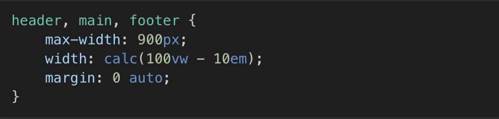
Before
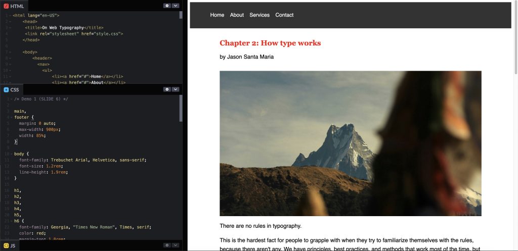
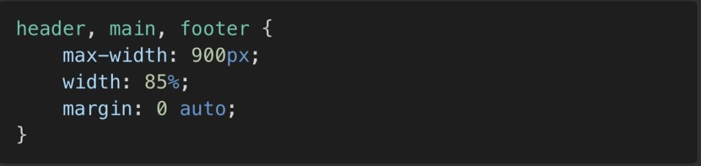
Current State: In this demo we have a html file that is orginally stylized with a width of 85% and centered to the parents container with margin: 0 auto;
Steps To apply calc() function:
- Keep the Defined
max-widthfor the container.
2. Change the percentage-based width for responsiveness to calc(100vw – 10em);
3. Keep the Center the content using margin: 0 auto;.
After
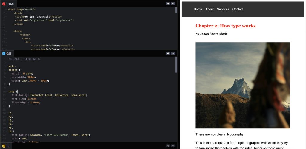
Changed State: In this new version the width code has been changed to a calc function. This will allows to have a more controlled dynamic margins as the screen resizes.
What has changed:
- The
width: calc(100vw - 10em);ensures a responsive design that adapts dynamically. - The difference is that, as the screen resizes, the content will always maintain a 5em margin on each side. In contrast, before, the content occupied 85% of the viewport width, leaving 15% unused. This approach could cause the layout to look different depending on the screen size.
What is the calc() CSS Function?
1. Always Include Spaces Around Operators
When using the calc() function, spaces are required around arithmetic operators (+, -, *, /). Without spaces, CSS will not interpret the calculation correctly.
Correct Usage:

Incorrect Usage:

Correct Usage:

Incorrect Usage:

2. No Space Between calc and Parentheses
The calc keyword must be immediately followed by parentheses without any spaces.
3. Operator Rules: Addition (+) and Subtraction (-)
Both operands must have explicit units. Mixing unitless values with unit-based values for these operations will cause an error.
Correct Usage:

Incorrect Usage:

Correct Usage:

Incorrect Usage:

4. Operator Rules: Multiplication (*) and Division (/)
One operand in the operator must be unitless. If both operands have units, the calculation will not work properly.
Tip: Avoid Unnecessary Use of calc()
If a value can be determined in advance, use a static value instead. Overusing calc() where it’s not needed can make the code more complex and harder to maintain.
Advanced Uses of calc()
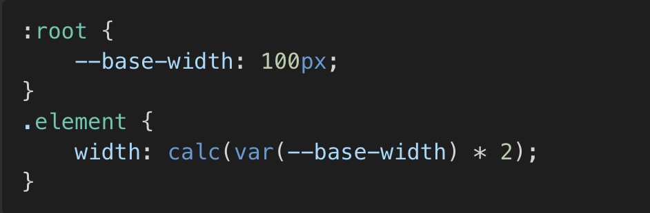
Using CSS Variables with calc()
CSS variables allow you to define values dynamically and modify them easily. calc() works well with CSS variables, making it a powerful tool for flexible layouts.

Nesting calc()
You can nest calc() expressions inside one another for more complex calculations.

Combining calc() with Other CSS Functions
The calc() function can be used inside other CSS functions, such as clamp().
Demo 2
Sticky Header with calc()
Goal: Create a sticky header while ensuring the main content adapts dynamically
Demo link: https://codepen.io/Fifi-K/pen/vEYLGQq
Before
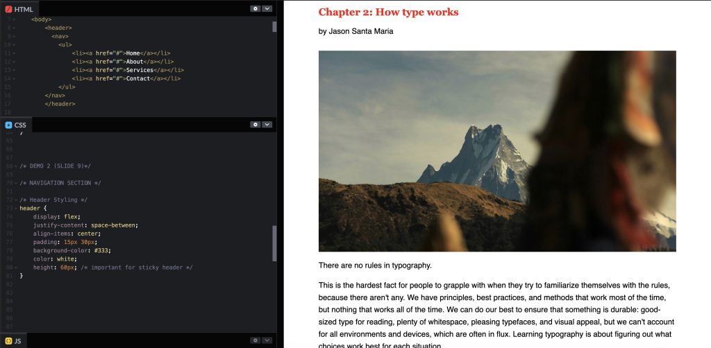
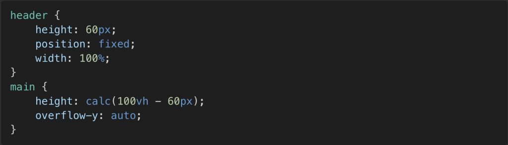
Current State:
- The header has a fixed height, (60px).
- The main content is styled with a default
height.
- There is no consideration for spacing between the header and the main content.
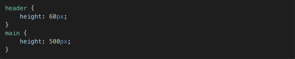
Steps To apply calc() function:
- Define a fixed height for the header (height: 60px;).
- Adjust the height of the main content dynamically using calc(100vh – 60px);.
- Add overflow-y: auto; to ensure scrolling is enabled when necessary.
After

Changed State:
- The main section height dynamically adjusts based on the viewport height minus the fixed height of the header.
- This ensures the layout remains responsive and adapts to different screen sizes.
What has changed:
- We declared the element main and defined new properties. Height with the value of calc(100vh – 60px)
- We add the overflow-y proprty with the value of auto.
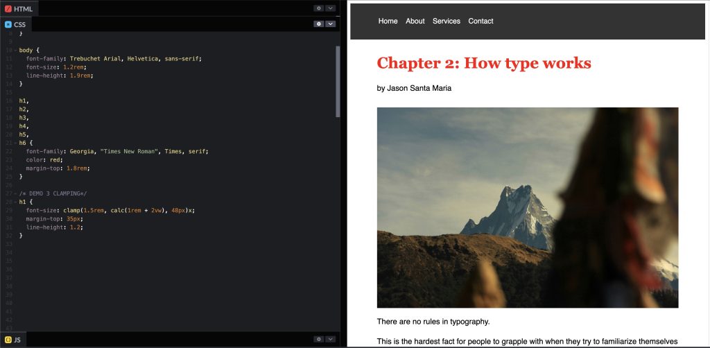
Demo 3
Clamping for Responsive Design
Goal: Ensure that font sizes remain within a specified range using clamp() combined with calc().
Demo link: https://codepen.io/Fifi-K/pen/vEYLGQq
Before

Current State:
- Font sizes are statically defined, leading to poor responsiveness.
- Small screens might have text too large, while large screens might have text too small.
Steps To apply calc() and clamp():
- Use clamp() to define a minimum, preferred, and maximum font size.
- Apply calc() to dynamically compute a preferred font size based on viewport width.
- Ensure text scales smoothly across different screen sizes.
After
Changed State:
- The font size is now responsive, adjusting dynamically while staying within the defined range.
- Ensures better readability across devices.
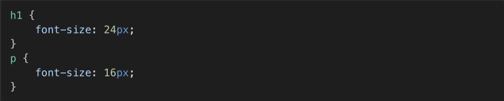
What has changed:
- We changed the value for font-size h1 using clamp.
- This allows you to mix absolute and relative units.
- Made a rule by using clamp, for minmum font, preferred size, and largest size.
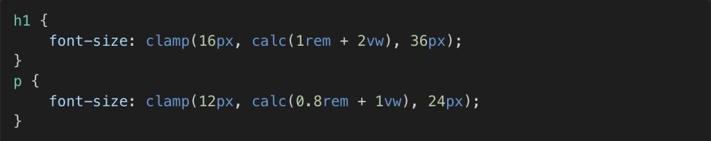
- Breaking Down the Preferred Value: calc(1rem + 2vw
- 1rem: By default, 1rem is 16px if the user hasn’t changed their browser settings. 1rem = 16px in a typical scenario.
- 2vw: 1vw equals 1% of the current viewport width. If the viewport width is 900px, then 2vw means 2% of 900px, which
- The math is 900px * 2 / 100 = 18px.
- Adding them together: 1rem (16px) + 2vw (18px) = 34px. <– hence the preferred size is 34px.

Conclusion
The calc() function is a powerful tool in CSS that enhances responsiveness, flexibility, and precision in layouts. By incorporating calc() into CSS properties, developers can create dynamic designs that adapt to different screen sizes, ensuring better user experiences.
- Change Width/Margin & make a dynamic layout that is controllable.
- Create a sticky header that dynamically adjusts content spacing.
- Maintain responsive typography by combining clamp() with calc().
By leveraging calc(), developers can achieve layouts that are both functional and visually appealing, reducing the need for excessive media queries and fixed values.
Leave a Reply